Mastering LINE Rich Menus: The Secret to High-Converting Official Accounts
In this article
Learn how to design high-converting LINE Rich Menus that turn followers into customers. Discover best practices for layout, sizing, and how to set them up in minutes.
Your LINE Official Account has a secret weapon. It’s the first thing customers see when they open your chat, and it takes up nearly 50% of the screen.
We’re talking about the Rich Menu.
For Japanese businesses, the Rich Menu is effectively your "mini-app" homepage. It transforms a standard chat interface into a powerful navigation hub where customers can book appointments, view menus, check hours, or visit your website—all with a single tap.
Despite its importance, many businesses get it wrong. They either skip it entirely (leaving the default keyboard view) or use a cluttered, confusing design that drives customers away.
Here is how to master the Rich Menu and turn your LINE Official Account into a conversion machine.
Why the Rich Menu Matters
Think of your Rich Menu as the primary navigation bar of your mobile website. In the context of LINE—where 95+ million users in Japan spend their time—it is arguably more important than your actual website's homepage.
- Visual Dominance: It occupies the bottom half of the chat screen, demanding attention.
- Action-Oriented: It reduces friction. Instead of typing "What are your hours?", a user taps "Business Info".
- Professionalism: A branded, well-designed menu signals that you are a legitimate, modern business.
The 3 Golden Rules of Rich Menu Design
1. Clarity Over Creativity
Your customers are in a hurry. They don't want to decipher abstract icons. Use clear, legible text labels alongside simple icons. If a user has to guess what a button does, you've lost them.
Bad: A vague star icon.
Good: A star icon with the label "Rewards".
2. Prioritize Your Top 3 Actions
Don't try to cram every possible link into your menu. Identify the top 3 actions that drive revenue or save time.
- Restaurants: Reserve, Menu, Access.
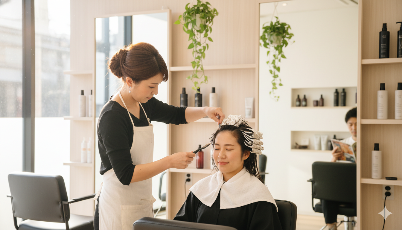
- Salons: Book Now, Style Gallery, Pricing.
- Retail: Shop Online, New Arrivals, Member Card.
3. Keep It Thumb-Friendly
LINE users are on mobile. Touch targets need to be large enough to tap comfortably without hitting the wrong button. The standard 6-up grid (2 rows of 3) is popular, but a 3-up or 4-up grid often performs better because the buttons are larger.
The Technical Headache
If you have tried to set up a custom Rich Menu directly in the LINE Official Account Manager or via API, you know the pain:
- Strict Sizing: You need to create an image that exactly matches LINE's pixel requirements (e.g., 2500px × 1686px).
- Mapping Coordinates: You have to define "tappable areas" using X/Y coordinates.
- JSON Payloads: For advanced behavior, you might need to deal with code.
For a busy business owner, this is hours of work in Photoshop and developer docs.
The Hero Wizard Way: Done in Minutes
This is exactly why we built Hero Wizard. We believe you shouldn't need a graphic designer or a developer to have a professional LINE presence.
With Herowiz, you can:
- Choose from proven templates: We have pre-designed layouts for restaurants, clinics, salons, and more.
- Customize instantly: accurate layouts are pre-configured. Just pick the actions you want.
- One-click sync: We handle the API sizing, coordinate mapping, and uploading instantly.
You can go from "no menu" to a "pro menu" in the time it takes to brew a cup of coffee.
Conclusion
Your LINE Rich Menu is the most valuable real estate you own in the Japanese digital ecosystem. Don't waste it.
By simplifying your design, focusing on key actions, and using the right tools, you can drastically increase engagement and conversions from your existing followers.
Ready to upgrade your LINE Official Account? Try Hero Wizard's Rich Menu builder for free and see the difference a professional menu makes.

Master LINE Growth
Get weekly playbooks on maximizing your LINE Official Account performance. No spam, just value.
Unsubscribe at any time.